Family Services of the North Shore is a non-profit, community-based agency. For over 60 years, we have been committed to making a deep and lasting impact across the entire North Shore, from Deep Cove to Bowen Island and every point in between. We offer counselling, support, education, and volunteer engagement opportunities to help you reach your full potential throughout your life, whenever you need us most.
Our Brand
Family Services of the North Shore brand uses bold and vibrant colours to embrace the diversity of individuals and families in our community, and the positive energy created when connections are made.
Family Services of the North Shore logo highlights the strategic vision and optimistic commitment to change lives together, while making a deep and lasting impact in our community. The distinctive bands encircling the heart are facilitating the strong, caring connections between the people in our community. These bands are pulling the community together, as one united force.
Logo: Usage Guidelines
The full-colour Family Services of the North Shore logo and tagline is our main logo and should be used only against a white background. It’s important to ensure that the tagline is legible.
Logo: Usage Guidelines
Don’t change the elements in the logo.
Don’t place the logo atop a busy or colourful background.
Don’t change the fonts or typographic elements.
Don’t change the spacing or proportions.
Don’t add effects, like dropshadows.
Don’t make it too small: ensure the text is always legible.
Logo: Alignment and Spacing
Alignment & Spacing
Leave at least the minimum amount of space between the logo and any other elements, including text. The minimum amount of space should be the height of the small type (NORTH SHORE) in the logo in all directions.
Flexible Logo System
Official logo: turquoise text
This version is to be used on all new Agency materials (brochure, annual report, etc).
Program logo: pink text
This version can be used with existing programs that use pink as a feature colour (EmbodyBC, etc).
Program logo: yellow text
This version can be used with any existing branded materials or programs that use yellow as the feature colour.
Note: Dark Yellow is used for text.
Logo: Different Uses
The reverse logo in white can be used on on solid-colour backgrounds. Please avoid placing the logo on photos or other patterns that may affect legibility.
Logo: One-Colour Uses
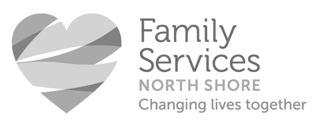
The one-colour logo in greyscale or violet can be used in select cases when full colour is not available.
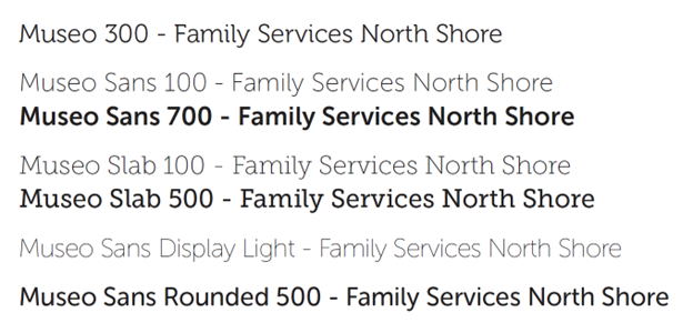
Family of Fonts
Museo offers an open style that feels friendly and approachable, with a modern edge. The variety of sans-serif and slab serif weights within the Museo family offer up flexibility when distinctive identities for programs and services are created, yet create consistency across all branded materials.
Colour Palette
The logo uses a bold and vibrant palette that embraces the diversity of the individuals and families in the community, and the positive energy created when connections are made. The colours are typically used individually as highlight colours against a white back-drop, and only combined all together in the heart visual. There are some instances where the primary or supplementary colours can be used as backgrounds in promotional materials.
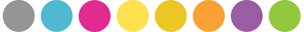
| DARK GREY #939597 C: 0% M: 0% Y: 0% K: 55% | TURQUOISE #50B8D1 C: 62% M: 7% Y: 14% K: 0% | PINK #E12B91 C: 5% M: 94% Y: 0% K: 0% | YELLOW #FEE150 C: 0% M: 7% Y: 80% K: 0% | DARK YELLOW (TEXT) #ECC625 C: 8% M: 18% Y: 96% K: 0% | ORANGE #F9A037 C: 0% M: 43% Y: 88% K: 0% | PURPLE #9A5DA3 C: 43% M: 74% Y: 1% K: 0% | GREEN #91C83E C: 48% M: 0% Y: 100% K: 0% |
For any questions about Family Services of the North Shore logo guidelines, please contact us at communications@familyservices.bc.ca